Two Men Bagel House App

UI/UX Design

Team: Anna (UI UX Designer/Researcher)
I am not associated with Two Men Bagel House in any way. This was a concept project.

Project Background

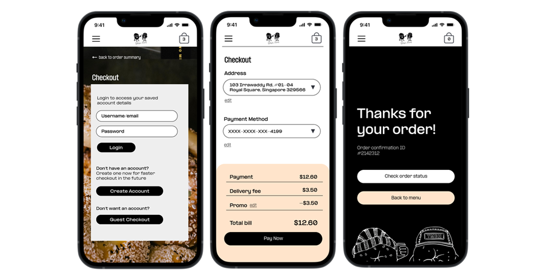
We’re creating Two Men Bagel House’s app to attract and retain customers in our online system. We are using platforms like GrabFood but they take a huge cut of our earnings and it is not a viable long term solution. Besides that, we want our own app that speaks to users in our brand voice and stands out with distinct Two Men Bagel House aesthetics. We want to create a product that is better than the standard food ordering platforms in the market, help improve sales, and increase customer satisfaction.

Study details

Research

  1. How long does it take for a user to select and order a bagel in the app?

  2. Are users able to successfully order the bagel that they want? 

  3. What can we learn from the steps users took to order a bagel?

  4. Are there any parts of the bagel ordering process where users are getting stuck? 

  5. Is the payment process easy for the customer?

Participants

  • Participants are anyone who orders out at least once a week.

  • Participants reside in Singapore.

  • Participants should be between 18 and 62.

  • 1 user of assistive technologies

  • 1 user who isn’t fluent in English

Methodology

  • Unmoderated usability study

  • Location: Singapore, remote (participants will go through the usability study in their own homes)

  • Date: Sessions will take place between September 15-18, 2022.

  • 5 participants will order a bagel through the app. Each participant will then complete a questionnaire on their experience. 

  • Each session will last for 25-30 minutes

Prototype tested

The low-fidelity app prototype for Bagel House was tested and can be viewed here.

Themes

(1) Search or filter option

3 out of 5 total participants said that the menu could have a search function, so that they do no need to scroll for a particular bagel they have in mind.


“If there are a lot of items on the menu, isn’t it good to add some sort of search or filter function. I don’t eat beef so a filter for other types of bagels would be good.”

Kevin, usability study participant

(2) Guest checkout

5 out of 5 total participants said creating an account was a hassle

4 out of 5 total participants expressed a desire for guest checkout


“I don’t really like the idea of being forced to create an account, maybe guest checkout can be an option?” 

— Hui Min, usability study participant

Insights & Recommendations

(1) People want a search or filter option

The app lacks popular features like recommendations section or a menu filter.

Action taken: Added a filter above the menu where uses can tap on options like “Beef” “Fish” “Chicken” “Breakfast”. Since the menu has less that 20 options, i felt that it was not necessary to add a Search bar. I felt that sorting these bagels according to common categories is more helpful to the user.

(2) People want the account creation process to be smoother

Users need a way to checkout without having to create an account

 Action taken: Added a guest checkout option. However, benefits of creating an account are told to users who are still recommended to make an account first.

(3) People want more visual cues

Users need visual cues for customization options 

 Action taken: Added a more obvious Go To Cart button. Description of bagels were also added to improve the menu’s user experience. Bearing in mind that Two Men Bagel House is extremely crowded during peak hours, a delivery notification panel was added as a final touch to communicate delays as soon as they happen to allow customers to set new expectations about their delivery.

High Fidelity Prototype revised based on insights and recomedations

The high-fidelity app prototype for Bagel House was revised and can be viewed here.

Next Steps


Conduct another round of usability studies to validate whether the pain points users experienced have been effectively addressed.