FRIPS / BRANDING

BRIEF

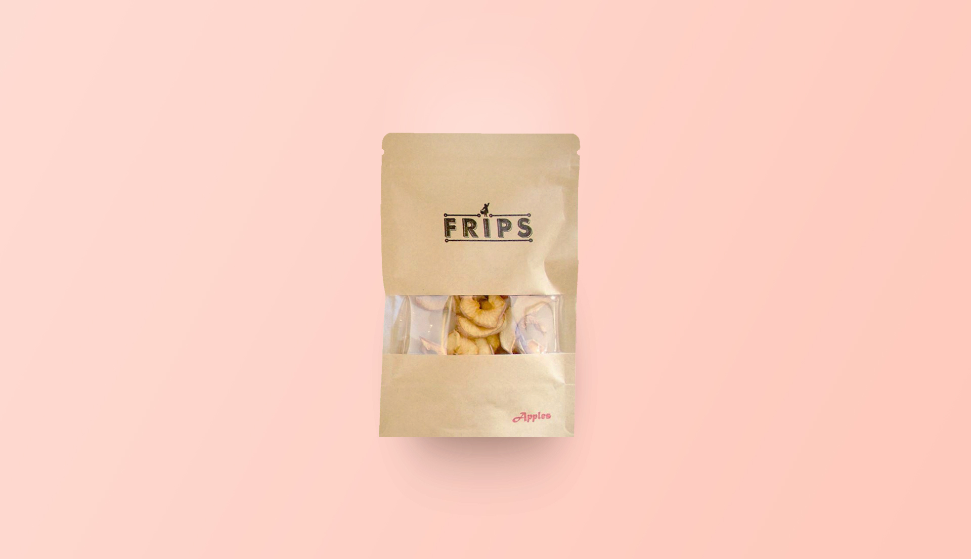
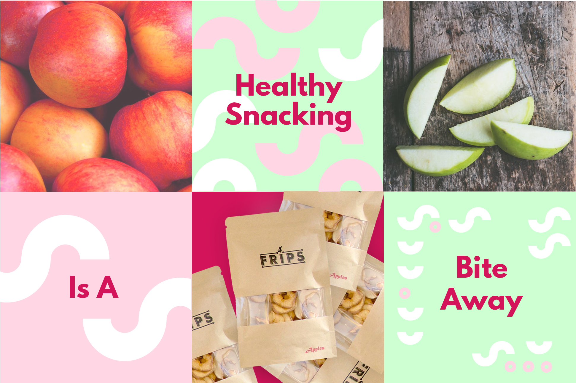
FRIPS was born from our society of excess and wastage. FRIPS collects excess fresh fruits and then processed them in the most natural way possible–no grease and no funny chemicals—so what you get is just pure, chewy, and nutritious goodness that will keep your afternoon peckish cravings at bay. 


FRIPS has been on the shelves for a few months, and they were looking to grow sales via online channels. My task was to design their online visual identity. They wanted an eye catching brand that would help their audience perceive FRIPS as a friend who does your chores for you. One fundamental challenge was to ensure the new look could easily be transferred to their packaging re-print and to spaces inside future retail environments. 
STRATEGY AND CREATIVE CONCEPT
The Erretres proposal included the creation of: the strategic brand concept (“More freedom equals more happiness”), the tone of voice (friendly and personal, with a touch of humor), strategic messages (“Free yourself.” “More freedom means more happiness.”), and the tagline (“Your personal cleaners”).
The concept is built around imagery of primitive constructions and tools. Since the earliest of times fire has been an essential element for mankind, and so we focused on  the grill house as a place to celebrate rituals. Throughout history humankind has 
always met around fire and food to celebrate victories in war, treaties between tribes, and so on. We wanted to develop a solid, lasting concept which steered clear of trends 
and fast fashion, taking the grill house back to basics with a touch of modernity.
 

LOGOTYPE

We used Avant Garde Bold typography to create the LimónClean logotype because it conveys a modern and clean image that’s also built to last. We added a graphic detail to the typography over the “o” in the corporate color, which works as an accent mark, is reminiscent of a sunrise, and is a nod to the buttons on cleaning and ironing machines

GRAPHIC SYSTEM

The visual language of the logo started off as a notion of leaving “eco-friendly” imprints using apple stamps. The idea is that this is what we did as kids. Another important communications resource is the “smiley” result. Designed expressly to transmit a friendly tone and a touch of humor, it has multiple graphic uses.

 
Apart from the typography, we proposed a chromatic range for the graphic system — a lime green color that refers back to the name, gives an optimistic tone to communications, and maintains certain continuity with the previous visual identity. Additionally, it reinforces the role of white for conveying cleanliness, and black for strength in messages.
 
We designed a series of pictograms and 2 graphic symbols (a check mark and a semicircle) to contrast the tedious task of cleaning clothes yourself with the freedom you can enjoy by letting LimónClean do it for you more efficiently.
 
Numbers, due to the company’s competitive pricing policy, play a big role in the brand’s communications. That is why we paid special attention to them during the design phase.
 
Another important communications resource is the “smiley”. Designed expressly to transmit a friendly tone and a touch of humor, it has multiple graphic uses.

The LimónClean identity uses minimal graphic resources (making the messages and tone of voice extra important) to reflect the efficiency, honesty and cleanness of the service.

About

Posters
Promotional pieces are sneak previews of a project ready to be revealed. Informational posters are for events and have more information. They can either contain an image or no image at all. 
 
Each delicious pack of FRIPS you buy contributes to reducing fresh food wastage, as we obtain perfectly delicious and edible supplies that would otherwise have been thrown away.

 Many desktop publishing packages and web page editors now use Lorem Ipsum as their default model text, and a search for ‘lorem ipsum’ will uncover many web sites still in their infancy.