Team: Anna (UI UX Designer/Researcher) Project duration: December 2022 - February 2023 This is a concept project.
PROJECT BACKGROUND
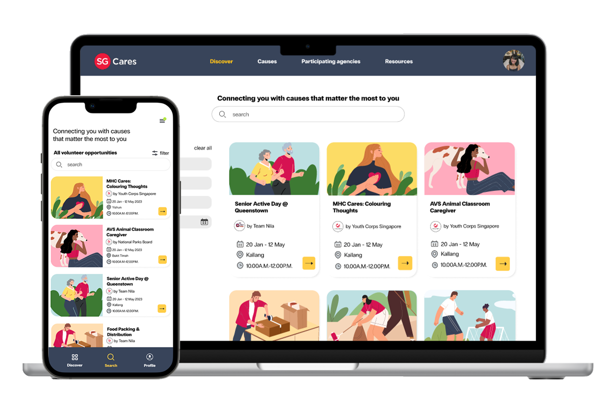
SG Volunteers is a digital platform under SG Cares – a national movement dedicated to guide and support the goodwill of all who live in Singapore to better help those in need. SG Volunteers helps the community find and participate in volunteer opportunities. Organisations can also create volunteer opportunities online.
A social network that’s good.
UNDERSTANDING THE USER
User Research
I used news articles and SG care’s website to develop interview questions, which were then used to conduct user interviews. Most interview participants reported that they did not know where they can find volunteer opportunities that matched their interests. The feedback received through research made it very clear that users would be open and willing to volunteer if they had access to an easy-to-use platform to explore, register and stay updated.
Persona & Problem Statement
2 personas were created.
Sarah- a working adult who wants to find volunteering opportunities in Design. She wants to use his skills and experience to help organisations.
Adriel- a retiree who needs an easy to use website to find volunteer opportunities. He wants to give back to society during her free time.
User Journey Map
Mapping Sarah’s user journey helped us plan for the necessary functions and visualise how a user could experience the app. Understanding the user guided me in creating a low-fidelity prototype for testing.
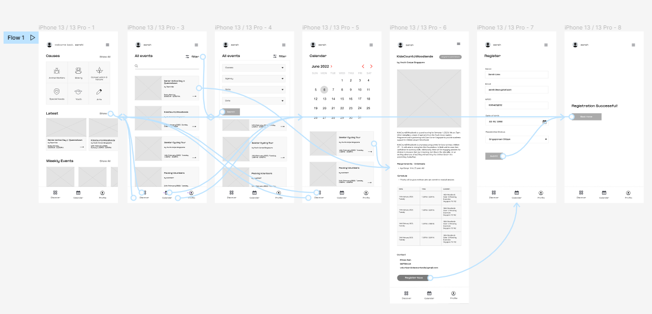
PROTOTYPE TESTED
The low-fidelity app prototype for SG Volunteers was tested and can be viewed here.
FINDINGS AFTER USABILITY STUDY
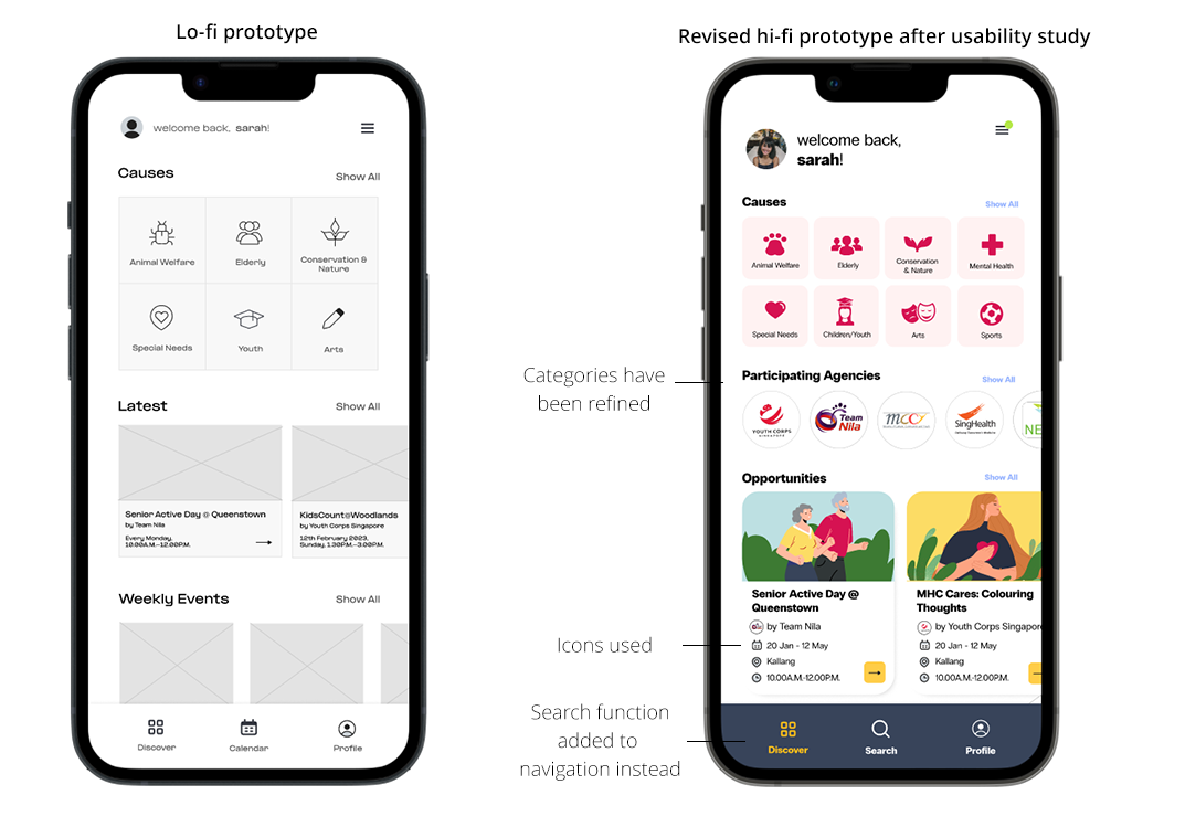
1. Ease of Use
4 out of 5 total participants said that the Search function is very important and should be on the navigation bar.
“The navigation bar at the bottom of the screen leads to Discover, Calendar and Profile. I think Search is more important than Calendar, since I want to see all the opportunities available and filter them myself. I don’t want only want to see them categorized by month.”
— “Insurgence”, usability study participant
Insight
Users want to search for volunteer opportunities quickly
What I did
Based on the insights from the usability studies, I applied design changes like providing a clear icon on the navigation bar to browse and search for volunteer opportunities. I removed the Calendar option as the catalogue is more important to users. Besides that, users can choose to filter by Date according on the Search page.
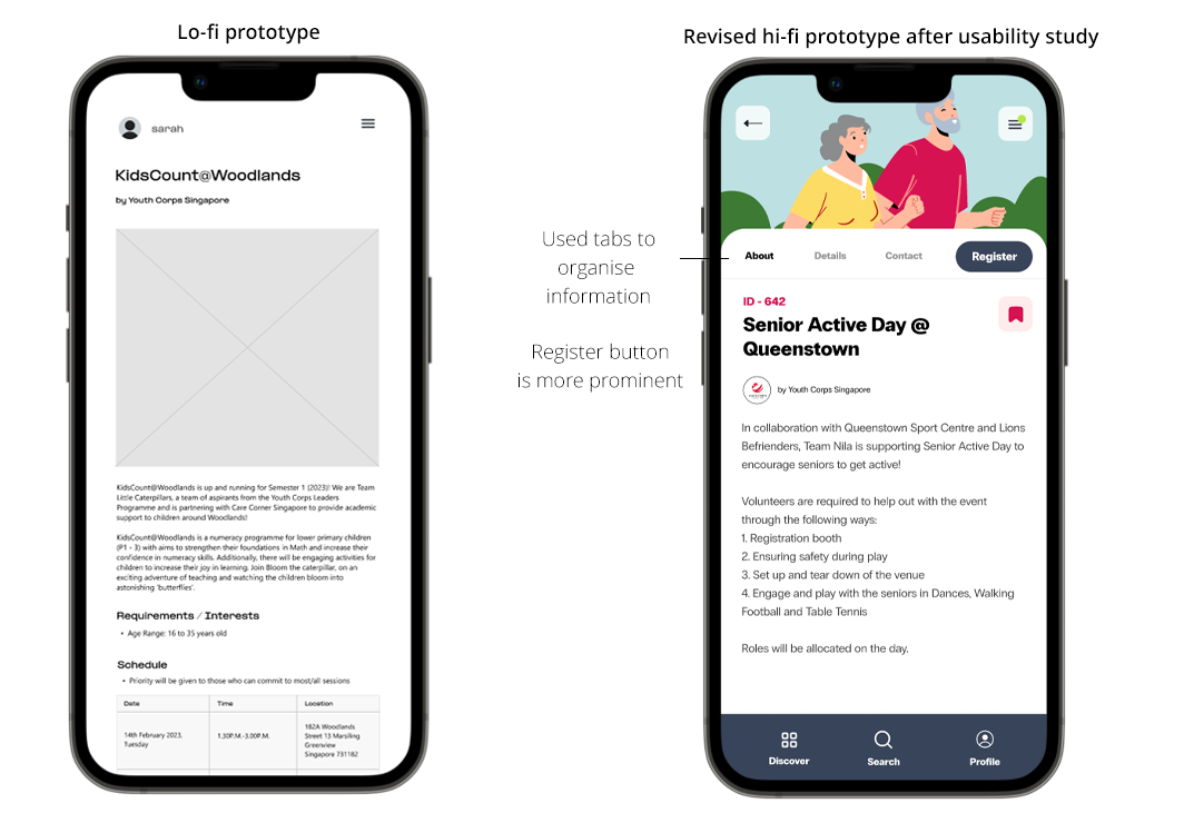
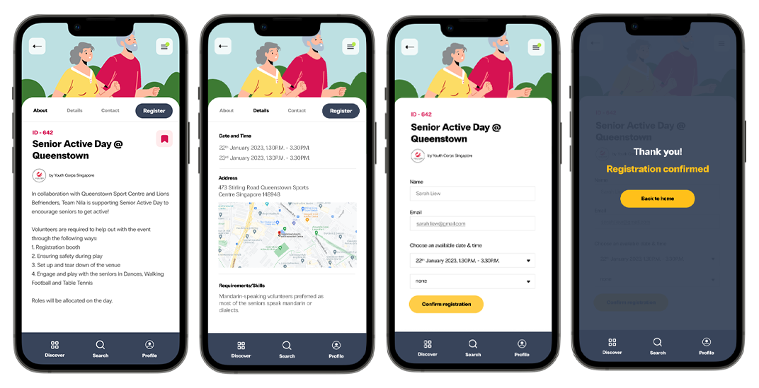
2. Information Overload
5 out of 5 total participants said that the app was wordy, while 4 out of 5 total participants expressed a desire for more icons
“Every volunteer opportunity has a lot of information packed onto one page. The date, time and location is not obvious enough.”
— Hui Min, usability study participant
Insight
Users want information to be organised more clearly
What I did
Entirely redesigned how information is presented. A tab system was used to organize information into categories About, Details, Contact. In this way, users do not get lost in the amount of information on the screen at one time. Furthermore icons were added for Time, Location and Date, so this information stands out.
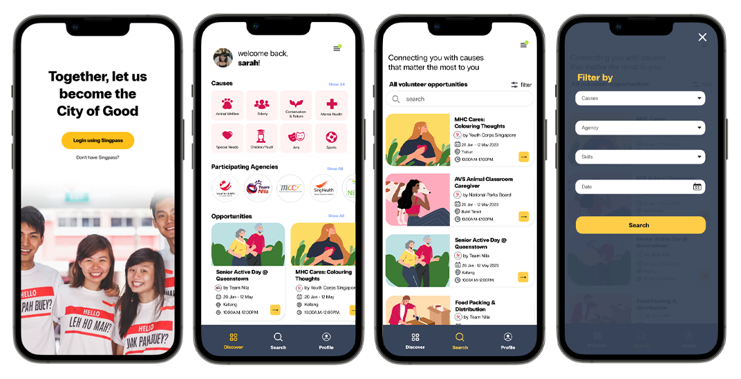
HIGH FIDELITY PROTOTYPE
Based on insights and recommendations, a high-fidelity app prototype for SG Volunteers was built and can be viewed here.
WEB PROTOTYPE
The high-fidelity web prototype for SG Volunteers was also revised and can be viewed here.
NEXT STEPS
I would conduct another round of usability studies to validate whether the pain points users experienced have been effectively addressed.
I would also ensure the platform is responsive on both web and mobile.
Once the basic user journey has be established with all the priority key functions, I would explore adding more features such as a Profile, Inbox and Bookmarks section.